If you are not a designer, it can be challenging to understand how to make good decisions about your logo. Is it good? Should it be updated? Sometimes, time and money are lost when direction is picked that is not quite working.
I want to share with you 7 guidelines that have helped me to keep my design projects on track. These guidelines are inspired by the work of designer and author Sean Adams.
After knowing these points you will have more peace of mind and will be better equipped to make wise decisions about your logo project.
Reminder: Brand is your whole business experience and perception. A logo is part of a brand’s visual identity system.
Here are some principles to keep in mind when working on your branding:
7 guidelines for logo design
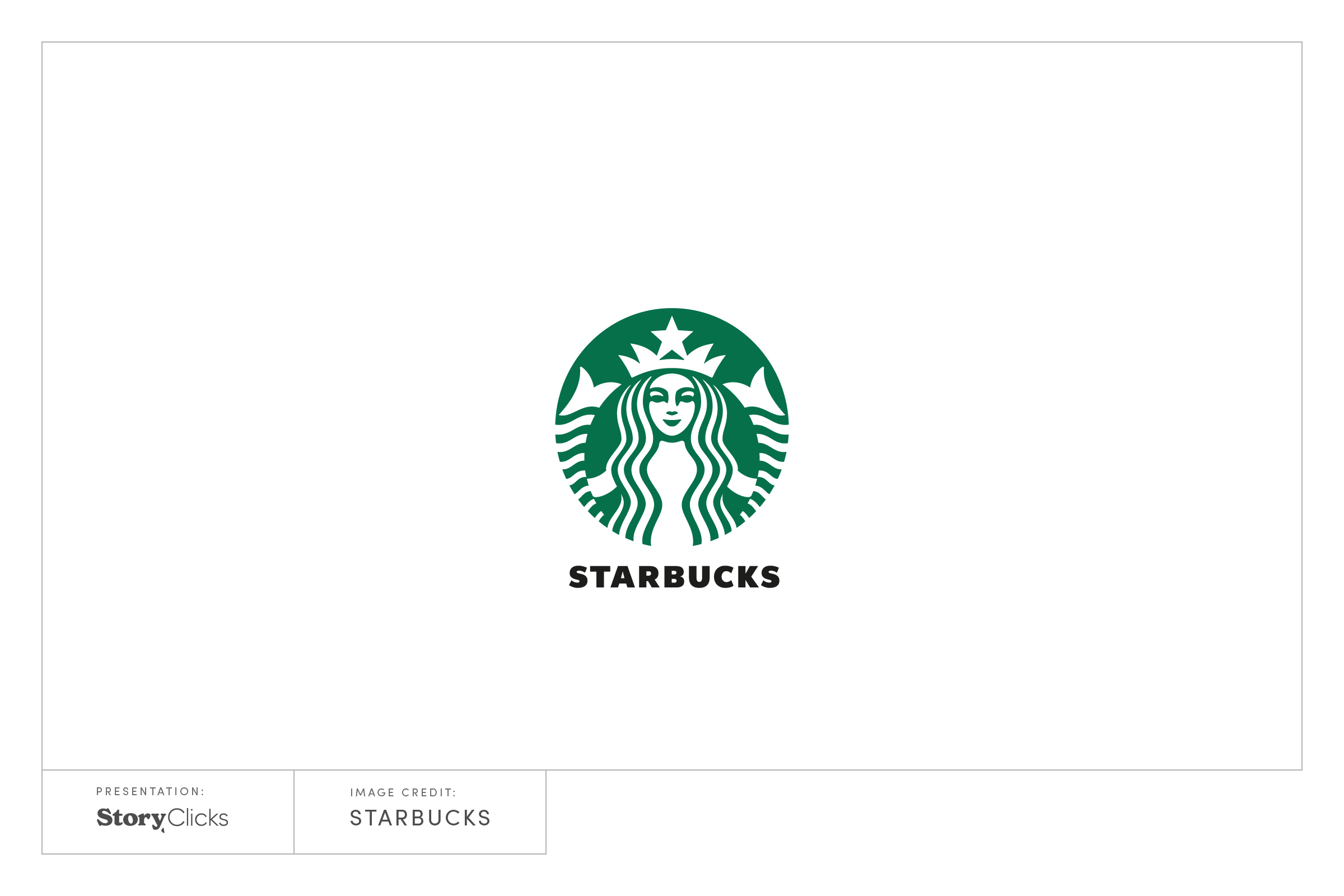
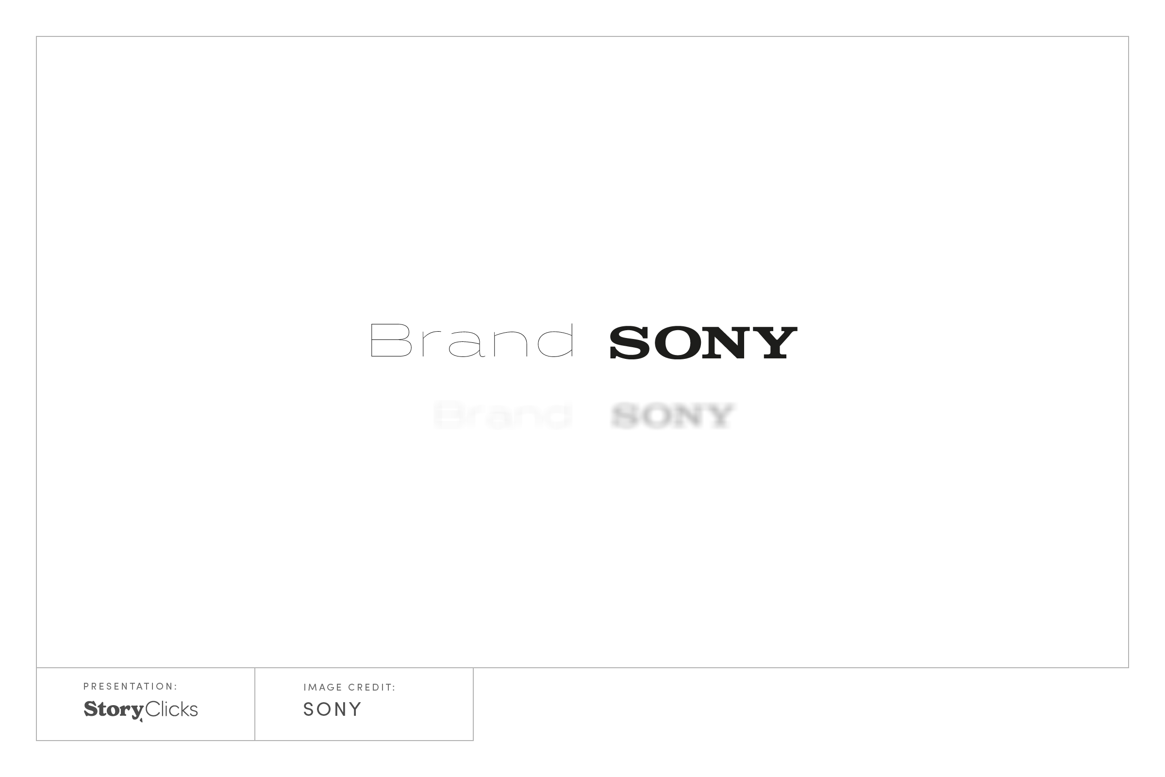
Is it easy to see it from across the room? Tiny, thin line typography and soft colors rarely succeed against bold, aggressive, and vibrant logos. Imagine your logo is at the bottom of the event poster together with five other logos. Can you see it well or does it disappear?
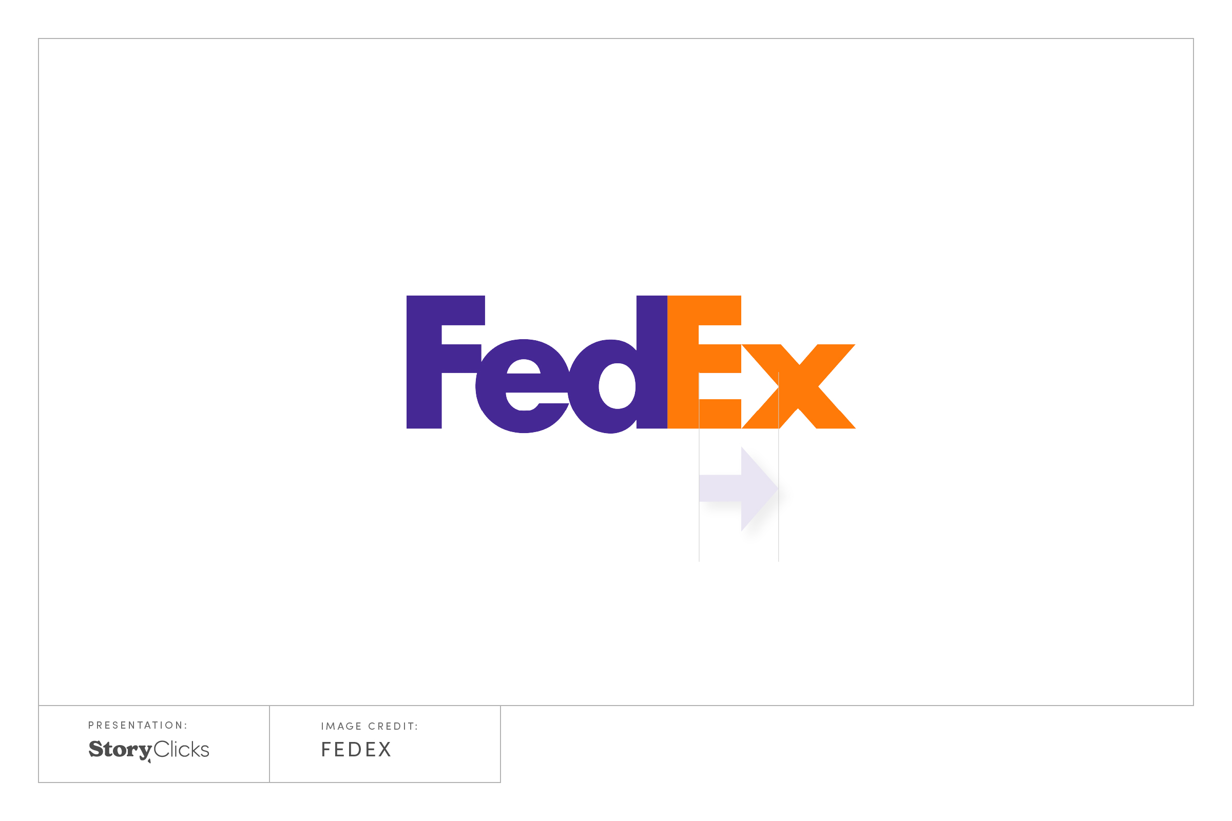
3. Logos must have mnemonic value.
Does it have something that makes it easy to remember? An easy way to do this is to pose a question: why is the last letter tilted? Why is that letter orange? Perhaps there is a chance to add meaning from a negative space
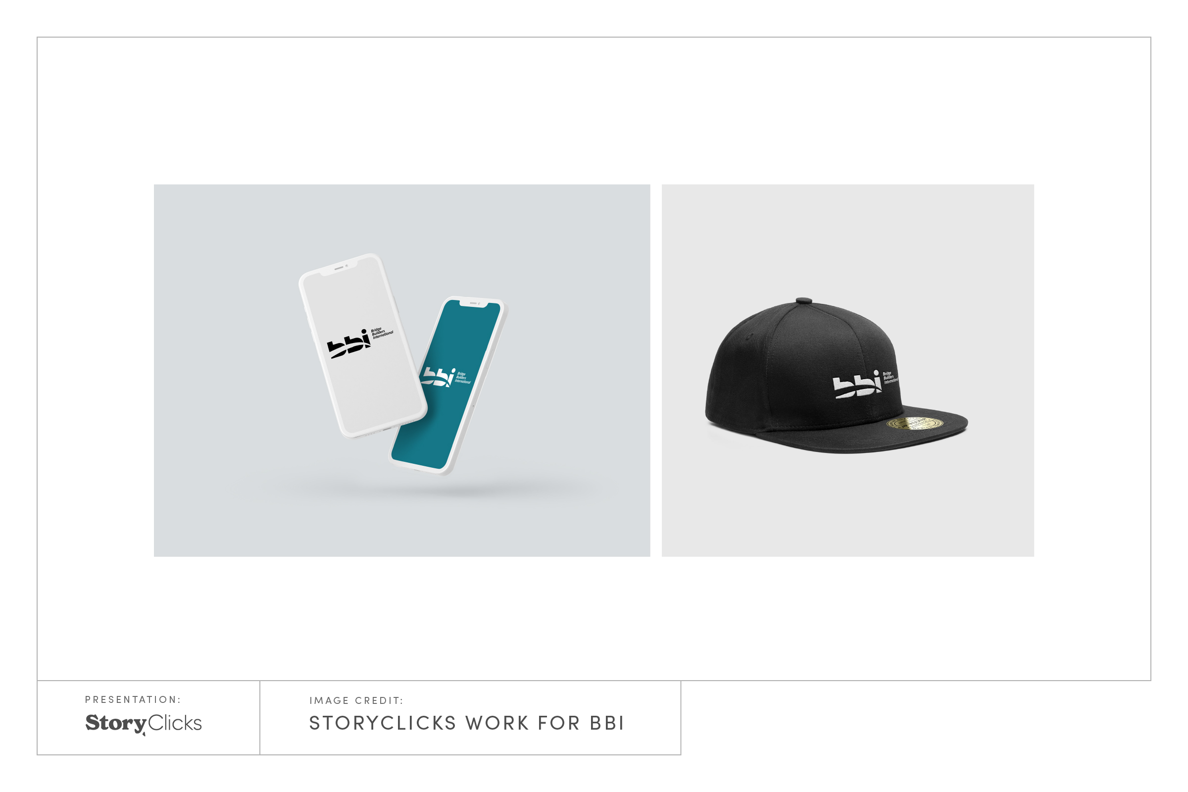
4. Logos must be able to exist in a variety of media or merchandise.
Can you sew the logo on a cap or a t-shirt easily?
How does it look from a distance? How will it work on social media?
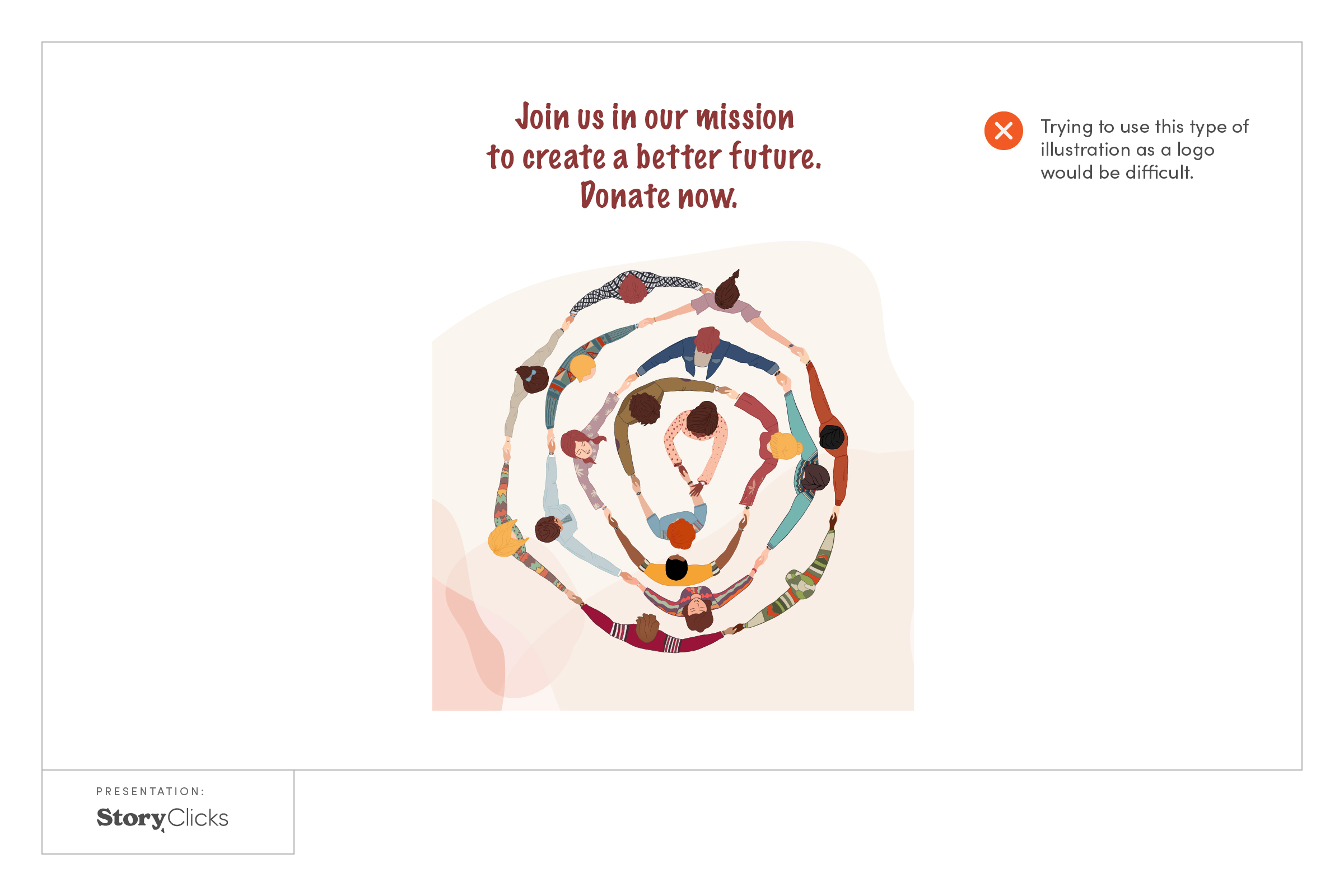
5. A logo is not an illustration.
An illustration has a lot of detail. Too many elements, features, and attributes are confusing and hard for people to remember the logo.
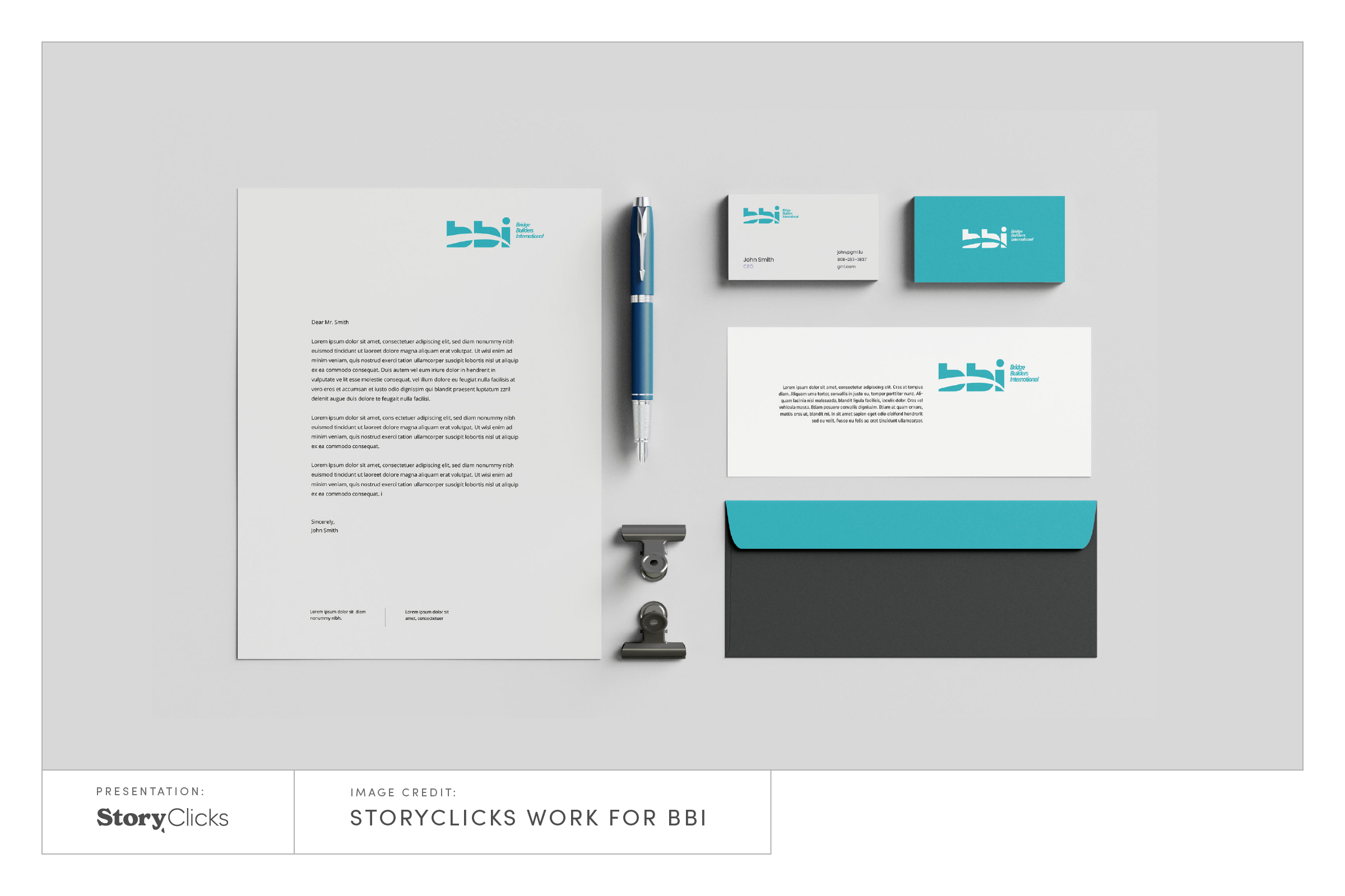
6. A brand’s visual system is based on its logo.
The logo is the main character in the visual system, but not the whole story. In the work process ways consider how it looks together with fonts, and pictures it will be used. How does it look on letterhead, brochures, or packaging?
7. A logo can not solve an organization’s problem.
If organizations have internal operational or reputation problems, rebranding – changing the external appearance is a short-term fix. A good logo is like a nice outfit, can make you look professional, but can’t change your personality.
Now that you know these seven guidelines you can use them as a filter to make sure your logo is designed in the right direction. You can relax a bit, have fun, and enjoy the creative process.
To become even more confident in your upcoming design project, download this e-book: How to save time and money in your upcoming design project.